

Novak Tennis Book Series: Serbian Edition Typesetting
Overview
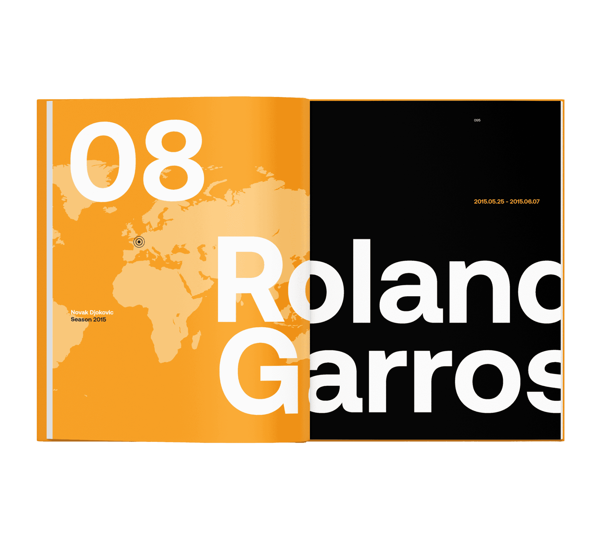
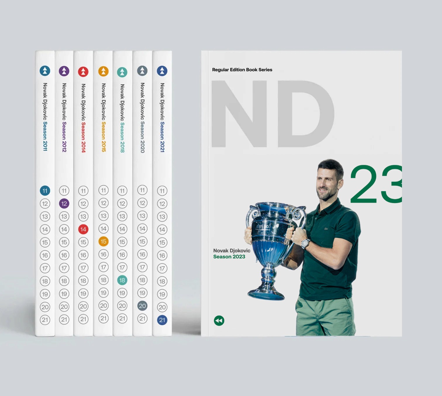
For the original Novak Djokovic tennis book series, my main responsibility was typesetting all seven volumes of the Serbian edition. The project called for a focus on clarity, consistency, and visual appeal across a substantial body of work, ensuring each book was easy to read and true to the brand’s spirit.
My Approach
I managed the entire typesetting process, carefully organizing chapter structures, headings, and text flows to maintain a cohesive look from start to finish. Special attention was paid to typography, spacing, and layout, balancing readability with a sense of elegance that matched the significance of Novak’s story.
Vision and Execution
The goal was to create an inviting reading experience for Serbian tennis fans and collectors, respecting both the content’s cultural importance and the expectations of a high-quality sports publication. My work ensured that every page felt accessible and visually balanced, from the opening dedication to the closing statistics.
Challenges and Solutions
With seven books to handle, maintaining consistency was a key challenge. I developed and applied a unified typesetting style guide, streamlining the process while making it easy to adapt layouts for each unique volume.
The final Serbian series delivers a polished, professional collection that captures Novak’s legacy, making these books a valued addition to any tennis fan’s library.


